Global Innovation
A program website for Polychrome, Inc.
Global Innovation is a website design project by LeftNote Studio, a small design agency Haidee and I started. The website presents information on an international professional training program run by Polychrome, Inc.
Objectives
The client gave us a very clear mission: create a professional website that works in developing countries' computers while also stands out from the typical outdated designs seen in this field.
We took this mission and broke it down into a few objectives:
- Code needs to have high compatibility with older browsers (IE 6, etc.)
- Design needs to be clean and professional
- Design needs to be creative and different from the norm
We also clarified a few things about our target audience:
- They are middle-aged working professionals
- They are from a wide range of cultural backgrounds
- Most of their computer systems are very outdated
- Mobile/responsive websites aren't necessary for which they will visit this site during work.
Research
The first step for us was to define the design norm in this field, namely international exchange business training companies, and then brainstorm how we can make it better and different.
We noticed that most of the websites fall into one of the two ends of a spectrum: some look like variations of popular templates from the 2000's, where buttons mimicking cheesy bubbles, glowing divs and table-based layout are common. Others look like a salad bowl of all the trendy design elements forced together - parallax, flat design, scroll animation, bright colors - you name it they sport it.
The problem with 2000-style templates is obvious. The pitfalls of bad trendy designs are less visible. Our client wants the site to work across different countries where computer systems may be very outdated, so fancy visual effects involving cutting-edge CSS3, power-hungry Javascripts are out of the question.
What about design elements, such as popular bright color palettes, and the various eye-candies seen on many websites? Our client wanted the website to be professional, and professional cross-cultural as well. We don't think many of the popular visual effects in the United States would translate well into third-world countries where professionals are still entrenched in pre-flat UI/UX design paradigm. Too bold of a design can shock users and create rather negative impressions, especially for middle-aged professionals.
Design and Development
The client can only meet with us a few times a month since they go on business trips often. I proposed slower version of Agile development, where we present small changes via screenshots and Skype meetings and save large design decisions for during physical meetings.
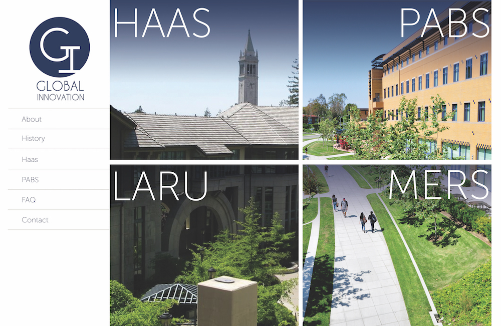
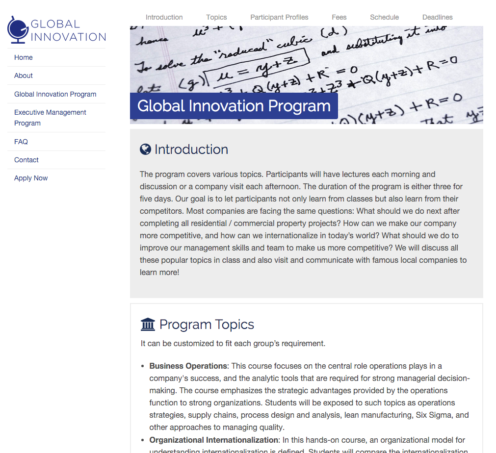
Here are some of our first mockups, produced by Haidee. We want to emphasize the programs hosted by the company. Instead of only using a typical navigation bar, we want to use images to create a more lasting impression on the audience.
Mockup 1
In this mockup, we aimed to present all the programs on the homepage and through images imply the locations. A rigid grid with clean and large typography conveys a sense of establishment and innovation. The navigation sidebar is subtle and non-distracting, but can be easily located if the user looks for it.
Mockup 2
Offering an alternative design to our client, we also came up with a more progressive single-page design. Visitors will see a refreshing and beautiful welcome splash view at frst, and as they scroll down, the grey navigation bar will be fixed to the top and the section they are currently viewing will be highlighted.
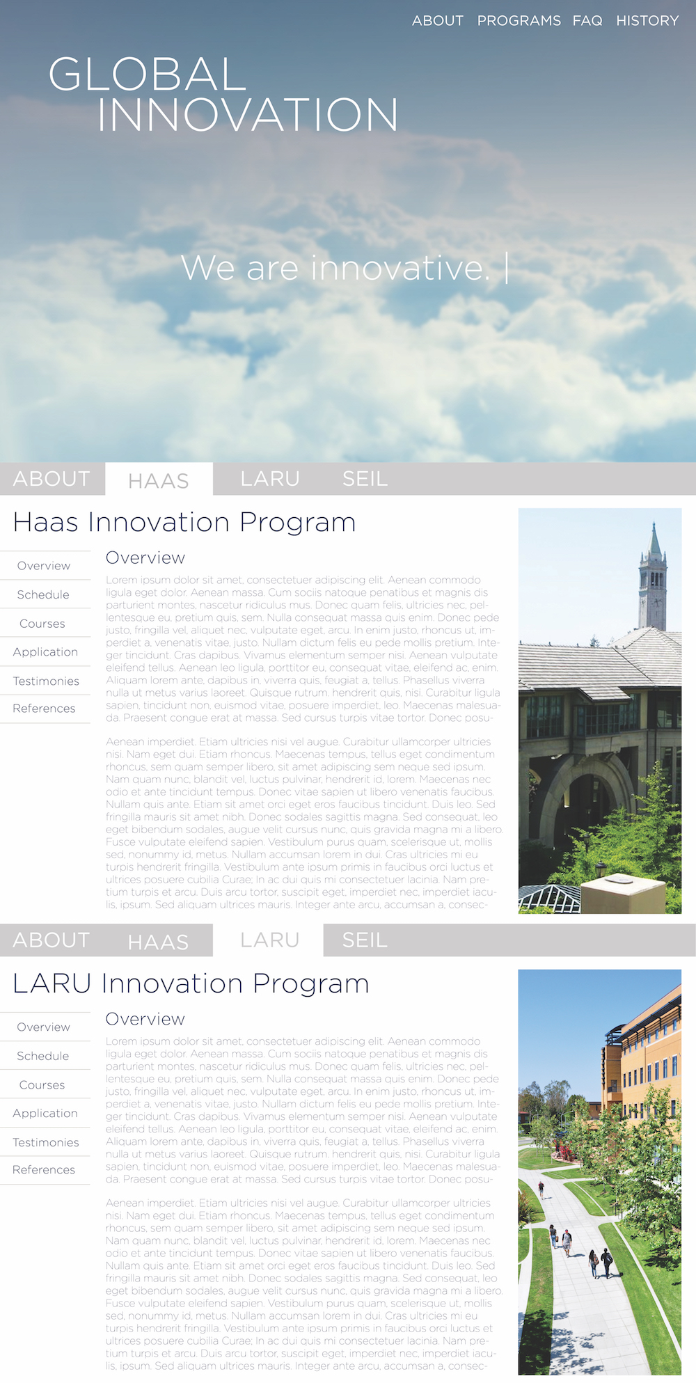
Our client liked the splash view idea, which to them is the "different" factor they are looking for. However, we were concerned that the Javascript heavy single-page design might not always work as expected on older browsers. Later, we worked on a new version which combines the splash screen with a less JS-dependent approach.
For individual program pages, we also wanted it to be consistent. The banner carries over the image which defines each program on the homepage.
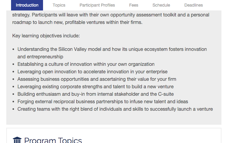
We took inspiration from our alternative design and implemented a sticky navigation bar that shows where you are and takes you to the sections you click on.
The website is waiting for the new programs to begin. We will gather more feedback once the the programs are open.